Thursday, June 9, 2016

Commissioned to Honor an American Hero

I would like to first thanks all who prayed for me during this commissioned project. I am deeply thankful and appreciative. This was a very emotional art piece for a deserving client. Ms. Loretta has went through various emotional hurdles in her efforts to honor her father's memory. She commissioned better yet trusted me to create a portrait of her father, 1st Lt. James Baker.


Lt. Baker was a member of the 101st Airborne and served as a platoon commander in Vietnam. Lt. Baker gave the ultimate sacrifice and was killed in action prior to being able to meet his baby daughter Loretta.  Lorretta seeking to connect and carry on her father's legacy joined the army herself. Loretta then went onto support and counsel student veterans at a local college.

Unfortunately Loretta had very few photos of Lt. Baker to remember him by. She asked is there anything that I could do, with the few photos she had.

So I had to work my mojo, but that was not good enough so I sought prayer from yinz guys. And my spiritual mother Pauline Z reminded me that I need to stop focusing on my so called Jedi powers and seek Gods help. So I did... Thanks mama P, you have been keeping me on the straight path since I was 6.

I heard from Loretta today and she was able to spend time at her father’s grave site and give honor to a man that inspired her. I am grateful that she trusted me with the task of bringing her father image to canvas and paper.

Anyhoo...


Here are the original photos I had to work with.
  

I then had to find a suitable body reference for Lt. Baker. This young Ranger did the trick... You can always depend on a Ranger to lead the way.


and then with the power of photoshop! Photoshop is a great tool for making photo references in this case. I printed a 4x7 of this photo ref for her too so she would have unique photo of her father with all his posthumous awards and honors.


I then did a pencil study for my base drawing


then an advanced sketch for the image


next did my base tones


and the final


And thus my first commissioned portrait 

So I'm like struggling to make a C in Advanced painting I told Professor Moyers... the other students may have better grades... but I'm the student that's gettin work! HOOAH! and ROO!


ILD311 Project 3 - Will Smith... Our last hope...

For project 3 we were tasked to draw a wealthy and famous person. I chose Will Smith. 
Why? A multitude of reasons. #1 He is famous #2 He is wealthy #3 He is the last hope for DC's cinematic universe. With the blunder of Batman VS Superman DC has a lot of work to compete with Marvel's Civil War. But at least B vs S was better than X-Men Age of Apocalypse. 

But my issue with DC in this character is that the non comic readers are going to confuse him with Deadpool and the in fall out and facebook banter is going to be classic. I love how people like to get on face book and sound like a comic expert because they saw a movie and read the back of an action figure box. Its like us nerds trying to talk about the Steelers or Penguins .We know the teams, the players and maybe the game, but thats about it... same for the non comic types. 

But I digress

This sketch is rather large, Im thinking like 20" x 24" ish and hand inked. No digital on this one. I also inked using brushes. I wanted to try and work as quick as possible, to simulate drawing at a Con. So the likeness is... meh but the message conveyed, at least I think.

Below is the final


These are the warmup sketches


Sunday, May 8, 2016

Advanced Painting Midterm...

The Sibyl of Delphi…


Prof David Moyers continues in his relentless efforts to push and forge me into a better artist. I love this guy for this! He tasked us to recreate an "old masters" painting.  Prof Moyers is a great inspiration and coach. I am proud to be one of his students. But I need to chill with the admiration because folks will think I am trying to kiss up... 


This piece is my midterm project for advanced painting. I chose the Delphic Sibyl. I was introduced to this piece by my mentor and muse Prof. Tracey Hawkins. I remember hearing listening to Prof. Hawkins explain the process of how Michelangelo came about painting the Sistine chapel. I was intrigued by Michelangelo’s process and the stories behind the paintings on the chapel ceiling. The Delphic Sibyl called to me, when I learned of her. I don’t know why. Maybe it was her muscular arms, or her powerful sitting pose, or possibly the eyes. Her eyes say volumes. Is she pissed, scared or about to beat the breaks off that little cherub behind her for screwing up her dictation? I don’t know but I want to find out!  What I enjoy most about it her is the subtle variation in color and the contrast of the blue of her scarf with the browns and reds of her hair and skin.

In creating this piece I started by making my base illustration. A simple line drawing as a guide for the value and tonal changes of the image.


I next created my base coats in Yellow Orche annd Viridi. I followed up by adding in a wash of Yellow orche and Burnt Sienna and another with Viridi and Phalo Blue. This gave a nice base of mid tones.


I did my final touch ups with washes of Phalo blue, Burnt Sienna and Milky white.


I plan to come back often and rework this piece, as I also work the Bathsheeba, by improving on mimicking the Master Michelangelo an also changing the model but keeping the base feel of this beautiful woman. 

Wednesday, May 4, 2016

ILD311 - All Hail the Queen

Today’s midterm assignment… pencil illustration using hatching and line work, without blending for shading….Yup right up my ally yo!

So, I chose one of my favorite subject… Katey Segal as Gemma Teller. Katey is just hot. I don’t care what yinz say…She was hot as Peggy Bundy, she was hot as Gemma Teller, she was hot as Nancy Gilroy…  

I like Katey because she is glam without glam. Yeah she has had some things worked on, but overall she has the “dude your mom is hot” vibe going on.


This illustration took all of 2 to 3 hours to complete (in multiple settings – because I was very sick while trying to complete this). I got a new light box, which was just awesome and it really helped lay out the basic structure and anatomy of this portrait.

initial pencil sketch in progress


First round critique


second round critique

ILD311 - My Brother's Keeper...


This project was pretty dear to me. It is a way to honor a fallen hero that I never met but had a great impact on me. Kenneth Lee Wimberly, SR. was a great man, great soldier, and great cop. He was struck down in his prime and left behind a legacy that should be remembered and honored.


Having the honor and privilege able to serve on the same SWAT team that Kenny help find is one of my most prideful moments I can recall being a cop. 


BOOYAH! Your brothers in arms miss you and those little brothers you never knew (me) honor and salute you!


Bathsheeba In Blue #2 Final renders

As I continue this journey in art, I am finding that I am evolving as a person also. As Pablo Picaso found himself in “blue” period, as well as Yves Klein (IKB) … I am also finding myself enamored with the hue, temperature, and tone of blue.  But mine is not one of depression it is one of mania! I am excited about the future, what it holds, the unsure apprehension, the challenge, the adventure. God created me a warrior. He created me with fear but also blessed me with the courage to conquer it. I was raised by both parents that I am not to fear and that I am to seek out that which seeks to destroy me and illuminate it without reservation, without question and without mercy! If that language is too harsh for you or you are offended… then you are not a warrior.

This same mindset found me to be drawn to the character Bathsheba… She was focus of King David’s lust, passion, and desire. She was his muse. There can be much told about the story, characters and reasons. I will leave you to ponder you own opinions and feel free to post them.   But for me I was inspired by the spectacular sculpture of Bathsheba by renowned sculptor Benjamin Victor. I happened to stumble on this masterpiece while doing anatomy research. I fell in love. I saw in Victor’s work how David fell into Bathsheba’s spell. Victor captured the moment perfectly. I

Thus Bathsheba in Blue will be my signature piece throughout my art life on this world.  I plan to continue to repaint this until I get it perfect, then paint it again changing the model and making her various woman, of various sizes, races and shapes. Because I think there is something more here than just a woman taking a bath and a King spying on her. There is a spiritual symphony of love, lust, lies and life being orchestrated before your very eyes. Unfortunately the church refuses to accept the beauty of this entire story and wants to focus on the “the thou shalts…”, this is evil, that is Holy instead of the understanding the choice beauty and freedom of free will, and the inevitable consequence of that choice….
 I wrote more than intended on this, but onto the art. I present you Bathsheba in Blue #2…


Thursday, April 14, 2016

ILD 420 Advanced Painting Project 1 - Bathsheba in Blue

Im back at it again. I'm making the transition from graphic artist to fine artist. Its not a transition as much as adding a skillet. I found that I ENJOY painting and want to become better.

Learning the basic techniques of scumbling, gradient and lifting using acrylic paints is awesome.

Developmental art as it evolved in progress


Final unmounted presentation

Tuesday, March 15, 2016

IDL 130 Complete ...

This has been long and drawn (literally) out. I have put a lot of time into this one. I learned more about color theory than I did about illustration on this one. I am seeing how to make my line art morph into hues. I still have a strong cartoon style, with a emphasis on hard edge line work, but I am learning how to let it go. You will see this develop more as I grow as an artist. I want to paint with the influence of Robert Mcginnis and Stanley Lau with the strong graphic line style of a Brian StelfreezeSara Pichelli or David Marquez.

But here you have it. Its damn 2 AM  I got presentations to do later this morning plus I gotta work later this afternoon... ugh!

Episode 4 : Tha Afro Connection Variant Cover


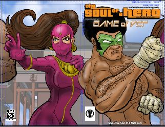
Episode #5 Game of Def

Episode #6 Enter the Black Fist Tiger Lotus


Here is the process...


 Initial Flats

Initial Shades

Primary Renders

Final Touchup and Graphics


 Whats best about these is that they are done. Mind you I normally hire cover artists for The Soul of a Hero. So if you are interested drop me a line. Its a paying gig. Not much but it pays...


ILD 130 Final Project WIP #2

Ok fans friends and family... We are coming down to the last stretch. I am finishing up my final for IDL 130. I came across a wonderful mistake. I have struggled with color since I was kid. It is my dream and goal to become an accomplished painter (then  migrate into sculpture). But I have had serious issues with color theory, hue, saturation and tone... Ya know the basics of color.

While fighting with Sketch Book pro.. whose interface is divine, I found the application keeps crashing while trying to paint this project. I racked! (tryed resaving in photoshop and reopening) I Tapped! (placed layers into SBP) I reassessed! (said screw it! This crap ain't working and I'm on a deadline!) So like a true art operator, I switched art systems. Just like in tactical shooting... If your primary weapons fails, jams or just runs dry... transition to your back up system.

I went back to Manga Studio. The brushes there are nice and I reworked my layers so that I had only basic layers. 1. Inks 2. Highlights 3. Shadows 4. Base Flats.  Then I had my "AH HA!" moment! I heard the heavenly voice of  Prof Hawkins in my subconsciousness  suggesting over my shoulder Sfumato! Grape Vine! Art for Art Sake! (in my mind she was dressed like a jedi master... it was kinda cool but kinda creepy at the same time. She had that shimmering Jedi halo, was wearing heels, a big ring, cell phone, starbucks coffee.. you know classic Tracey...  But then in the background was Brian Miller from Hi Fi Color and David Marquez from Marvel's Miles Moralez: Ultimate Spiderman from Hi Fi Color and But I digress)

I realized why my mash up images in color (and in black and white) suck is because I am not using atmospheric effects on color. So I started using basic circular and linear gradients on the flats... and you know what! IT LOOKS COOL! It is cutting my coloring time drastically down.

Ok, time to take a break. I have been at it for like 2 hrs. I need to jog for 30 min and then I'll come back to it.


Basic Flats


Basic Shades

Monday, March 14, 2016

Final Project for ILD 130 - Work in Progress

So here I go, I'm going into finals for this semester. Thus far you have seen my first two projects. For the final, I was allowed to use digital support. I thought it would go faster but life just kept catching up to me. I have had new clients, new projects and just school work. I planned to have this thing completed last week but I'm still working!!!

Professor Henderson keeps challenging me to do better and put out better work. SO I am trying.

The main change was switching over to a new tablet. I primarily used as WACOM Bamboo CTL-460 and an HUIO Pro 610H. The Wacom, is pretty reliable, just small. Its small size, though compact and fits well in my art kit, its hard to draw on a times. I get into the groove and am able to put out work. But its so much easier drawing large arcs and I can see a difference in the art. As for the Huion.... meh... I could take it or leave it. I liked the larger size, but the drivers are not the best. The have updated them and they work better. But sometimes there is still a slight lag and delay. Overall it does what its supposed to.

I just was able to get my hands on a WACOM Intuos Medium PK-640. Its a little bigger and works great. I am going to get the Large next. I use the large at school and it works great. It has the size and feel of actually working on a 8.5x11 sheet of paper. So I can get the detail and feel I need without having to zoom in and out in my drawing/ painting program.

Initial Layout and Comps
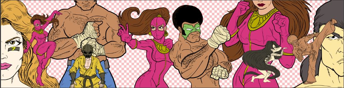
As you can see I am working it out. This project calls for a multi image piece image that has at least 3 smaller images. I chose to make a continuous cover for upcoming story arc for my web comic
 The Soul of a Hero.  The covers when spread out will make a nice panoramic styled poster.

Each cover is its own element, but when placed on a shelf or cased it will be a neat panoramic mural type piece.

These were quick 11x17 sketches using my signature blue bic pen approach. I love the feel of the blue bic pen. In the future I plan to start doing more detailed blue bic pen sketches. I want to be able to create art in various media.

You will notice the Bruce Lee Kung Fu film theme and genre. These episodes are my homage and love letter to those iconic and influential films.

Episode / Issue # 4: Way of the Black Fist Lotus


Episode / Issue # 5: Afro of Fury

Episode / Issue # 4: Da Game of Def


tight pencils


I'm working in Manga Studio. I do most of my digital sketching using the pencil tool to simulate a no photo blue pencil. The cover template is also a non photo blue graphic created in adobe illustrator.


Initial Inks
Here are my initial inks. I have to give a shout out to Prof Tracey Hawkins for beating the idea of Sfumato into my head. This effect helps give the image depth and the characters in the mid ground look like they are in the back. I didn't add the effect to the background yet.

Tuesday, March 1, 2016

Color Study in purple

Tonight's color study is of my frat brother G Smooth. 
As you know the goal is to become a better color based artist, understanding that it will push my illustration skills further.  I am prepping for my ILD130 final exam, which will be in full color