Tuesday, March 15, 2016

IDL 130 Complete ...

This has been long and drawn (literally) out. I have put a lot of time into this one. I learned more about color theory than I did about illustration on this one. I am seeing how to make my line art morph into hues. I still have a strong cartoon style, with a emphasis on hard edge line work, but I am learning how to let it go. You will see this develop more as I grow as an artist. I want to paint with the influence of Robert Mcginnis and Stanley Lau with the strong graphic line style of a Brian StelfreezeSara Pichelli or David Marquez.

But here you have it. Its damn 2 AM  I got presentations to do later this morning plus I gotta work later this afternoon... ugh!

Episode 4 : Tha Afro Connection Variant Cover


Episode #5 Game of Def

Episode #6 Enter the Black Fist Tiger Lotus


Here is the process...


 Initial Flats

Initial Shades

Primary Renders

Final Touchup and Graphics


 Whats best about these is that they are done. Mind you I normally hire cover artists for The Soul of a Hero. So if you are interested drop me a line. Its a paying gig. Not much but it pays...


ILD 130 Final Project WIP #2

Ok fans friends and family... We are coming down to the last stretch. I am finishing up my final for IDL 130. I came across a wonderful mistake. I have struggled with color since I was kid. It is my dream and goal to become an accomplished painter (then  migrate into sculpture). But I have had serious issues with color theory, hue, saturation and tone... Ya know the basics of color.

While fighting with Sketch Book pro.. whose interface is divine, I found the application keeps crashing while trying to paint this project. I racked! (tryed resaving in photoshop and reopening) I Tapped! (placed layers into SBP) I reassessed! (said screw it! This crap ain't working and I'm on a deadline!) So like a true art operator, I switched art systems. Just like in tactical shooting... If your primary weapons fails, jams or just runs dry... transition to your back up system.

I went back to Manga Studio. The brushes there are nice and I reworked my layers so that I had only basic layers. 1. Inks 2. Highlights 3. Shadows 4. Base Flats.  Then I had my "AH HA!" moment! I heard the heavenly voice of  Prof Hawkins in my subconsciousness  suggesting over my shoulder Sfumato! Grape Vine! Art for Art Sake! (in my mind she was dressed like a jedi master... it was kinda cool but kinda creepy at the same time. She had that shimmering Jedi halo, was wearing heels, a big ring, cell phone, starbucks coffee.. you know classic Tracey...  But then in the background was Brian Miller from Hi Fi Color and David Marquez from Marvel's Miles Moralez: Ultimate Spiderman from Hi Fi Color and But I digress)

I realized why my mash up images in color (and in black and white) suck is because I am not using atmospheric effects on color. So I started using basic circular and linear gradients on the flats... and you know what! IT LOOKS COOL! It is cutting my coloring time drastically down.

Ok, time to take a break. I have been at it for like 2 hrs. I need to jog for 30 min and then I'll come back to it.


Basic Flats


Basic Shades

Monday, March 14, 2016

Final Project for ILD 130 - Work in Progress

So here I go, I'm going into finals for this semester. Thus far you have seen my first two projects. For the final, I was allowed to use digital support. I thought it would go faster but life just kept catching up to me. I have had new clients, new projects and just school work. I planned to have this thing completed last week but I'm still working!!!

Professor Henderson keeps challenging me to do better and put out better work. SO I am trying.

The main change was switching over to a new tablet. I primarily used as WACOM Bamboo CTL-460 and an HUIO Pro 610H. The Wacom, is pretty reliable, just small. Its small size, though compact and fits well in my art kit, its hard to draw on a times. I get into the groove and am able to put out work. But its so much easier drawing large arcs and I can see a difference in the art. As for the Huion.... meh... I could take it or leave it. I liked the larger size, but the drivers are not the best. The have updated them and they work better. But sometimes there is still a slight lag and delay. Overall it does what its supposed to.

I just was able to get my hands on a WACOM Intuos Medium PK-640. Its a little bigger and works great. I am going to get the Large next. I use the large at school and it works great. It has the size and feel of actually working on a 8.5x11 sheet of paper. So I can get the detail and feel I need without having to zoom in and out in my drawing/ painting program.

Initial Layout and Comps
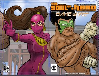
As you can see I am working it out. This project calls for a multi image piece image that has at least 3 smaller images. I chose to make a continuous cover for upcoming story arc for my web comic
 The Soul of a Hero.  The covers when spread out will make a nice panoramic styled poster.

Each cover is its own element, but when placed on a shelf or cased it will be a neat panoramic mural type piece.

These were quick 11x17 sketches using my signature blue bic pen approach. I love the feel of the blue bic pen. In the future I plan to start doing more detailed blue bic pen sketches. I want to be able to create art in various media.

You will notice the Bruce Lee Kung Fu film theme and genre. These episodes are my homage and love letter to those iconic and influential films.

Episode / Issue # 4: Way of the Black Fist Lotus


Episode / Issue # 5: Afro of Fury

Episode / Issue # 4: Da Game of Def


tight pencils


I'm working in Manga Studio. I do most of my digital sketching using the pencil tool to simulate a no photo blue pencil. The cover template is also a non photo blue graphic created in adobe illustrator.
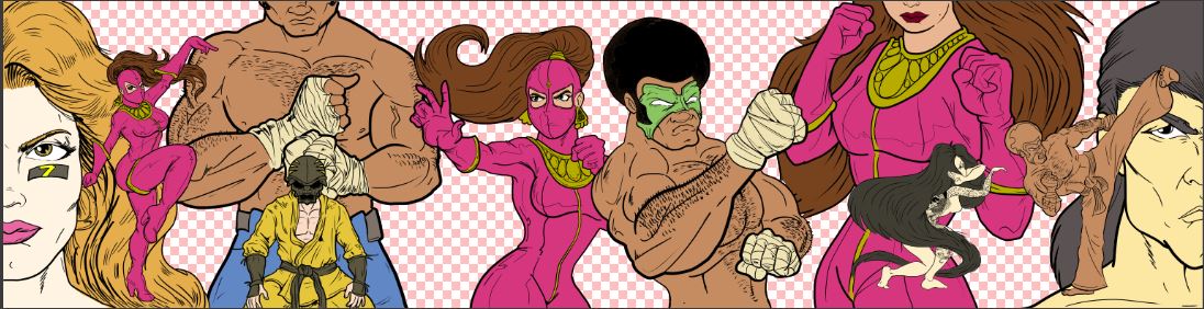


Initial Inks
Here are my initial inks. I have to give a shout out to Prof Tracey Hawkins for beating the idea of Sfumato into my head. This effect helps give the image depth and the characters in the mid ground look like they are in the back. I didn't add the effect to the background yet.

Tuesday, March 1, 2016

Color Study in purple

Tonight's color study is of my frat brother G Smooth. 
As you know the goal is to become a better color based artist, understanding that it will push my illustration skills further.  I am prepping for my ILD130 final exam, which will be in full color