Saturday, January 30, 2016

ILD130 - Final presentation art - Cat Women of the Moon

Final Concept Poster Art

I started the concept work earlier today. I took a 3 hr study creative break and watch The Reverent , . Good movie but not inspiring for this piece. I think this project came together much better then project 1. I am still not too pleased though. I would have rather did the entire piece digital. It seemed redundant to layout my ideas digitally. Light box trace them, hand ink and then scan, touch up in photoshop for final. This is clearly a 4 hour project that took about 8. I am pleased though with the hand inks, they look much better than my digital inks normally do. I think it mostly had to do with the Huion H610 digital tablet I use. Its WAAAY cheaper than the Wacom Intuos 5 .

Development Sketches


I reworked my initial pencils. I took the advice of Prof. Henderson from my previous project. The female character was plain ol ugly. And this woman was quickly heading this direction too. I found that I was trying to focus too much on the reference image instead of making her pretty using my skill set. Most of the reasons that she was unattractive was due to poor anatomy. So Instead of trying to draw only what I saw, I constructed the skull so I could get better references on where the features should fall. This helped make her more attractive looking


Final Development work


I started to develop the inks using inking brush pens, technical pens  and also a water color brushes and india ink. I started out with my line art, and then added the tonal hues. I found out the hard way that my technical pens ARE NOT waterproof. And when I added the washes for the the flesh hues. Also I scanned the image and found that it lost clarity and needed to be touched up in photoshop. Again this seemed to be working backwards to me. It added steps that added time to the project. Scanning, clean up, adding a gradient, expanding the background are all things that i could have done quickly and initially. But I do understand the importance of  learning the way of the traditional pen..

Friday, January 29, 2016

ILD 130 - Project 2 - Cat Women of the Moon

Initial Final Concept Sketch


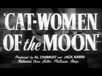
We were tasked with coming up with art work for a sci fi work that was in free domain. I did an internet search and found Cat Women of the Moon . But I wanted to add my own twist. I like having strong minority characters. Since we don't see black people portrayed often as main characters in sci fi, I chose this route. Note to Jade Smith, Will Smith, and Stacey Dash if you dont like what the mainstream is doing, USE YOUR DAMN MONEY TO MAKE GOOD STUFF FOR THE FANS! Host free showings, cast unknowns and make cameos in the film projects DAMMIT. Stop bitchin' and use your creativity as a weapon and stop damn whinning!  RANT OVER! anyway...  I watched this B movie and it was horribly wonderful. I liked it. What more could a man ask for, cat women, space, and strong sexual over tones. Watch the full movie here... 


Developmental Work
 

I created the afro woman from a nice photo I found of a woman with a fro looking over her shoulder. It had the attitude that I liked and fit. I created a logo using the fonts Alien Encounters and Alien League. These fit and worked well for the concept. Giving reference to the movie Alien

Initial Concept Sketch


I did this initial concept sketch in class. I wanted to use Viola Davis as my primary photo character reference, but moved against it. There are many reasons why. First, I think the woman is totally beautiful, and when I draw her I want to make sure the likeness is accurate. Since my skill set is not there yet, I am holding off. I also created a design problem, which I was (for lack of a better reason) was too lazy to fix. I visioned the main cat woman clenched fist with the astronauts standing on the moon or with the nemesis cat woman looming over them with a clenched fist. Her afro would fade into the moon. I wanted to make a shout out to the Flash Gordon movie poster of Ming the Merciless. But I also wanted the astronauts standing on the moon in the foreground too. This just didn't work because there would be two moons. I thought the astronauts could be standing on the logo, but the design was then too cluttered. So I reconstructed my layout so I could go forward with the project.


 Inspirational images 


Again the design and concept of the original is dated. But it campy, sexy, and fun! My concept does not capitalize on this. But the project didn't call for this, just and illustration. In a combination of being lazy and not having the time between my full time job, client project, and working on The Soul of Hero


Reference Images

basic moon from Wikipedia and the sexy afro woman. I made her more cat like and made her makeup look like something from the original film.

check back later this weekend as this project develops.

Again your feedback good, bad and ugly is much appreciated...

-DL 

ILD 130 Project #1 Final


Here is the final version. I'm not too pleased with the final colors. They look juvenile, sketchy and more like concept art to me. To rectify this art skill set deficiency, i have made it a point to do color studies daily using colored pencil, paint or markers. BUT NON DIGITAL. I want to increase my tradition art skills set. My art contemporary Jose G, has continually stressed the importance of traditional and non digital development. He has never said truer words of advice to me. 

This is not a regimen it is a process...

Thursday, January 21, 2016

ILD 130 WIP, War of the Worlds. Final Inks

Here are the final inks for the War of the World Illustration Project


Final inks with graphics with placement


I took the advice of Prof. Henderson and gave the tripod more "breathing room" and separated it from the title text. I also placed the martian more into the foreground by adding a hand and arm sprawled in front of Big Liz's foot.  

The challenge is going to be adding the color. Also since this image is digitally imaged I will have to re-ink it or find a way to creatively put this image onto paper. 

It seems that I will be working backwards, I would normally just digitally color a project like this, but the assignment requirement is that is done in color pencil.

So which leads me to yet another dilemma . I need a light box. I built one in high school, using 2x4's and regular light bulbs as a light source. I will probably build another tomorrow, but the light source will be a fluorescent light. I cant see paying $120 at Hobby Lobby for a box with a light source, when I can build one for about $25 to $50, and it will be to my own personal specs.

Please make feel free to comments, suggestions, rants, complaints or what ever yinz think will make this better... 


Sunday, January 17, 2016

Color Pencils Studies - Artist Alley training!

I am working on my colored pencil techniques for this upcoming art illustration project. 

I decided that each week or every few days I will do a color pencil study of my favorite comic book superheroes. 

I am timing myself of these. Right now I am giving myself 2 hrs a sketch, I want to get my time to 30 min sketch. Then I can start hammering them out in artist alley and make a profit!.


Friday, January 15, 2016

ILD130 - Project #1 - War of the Worlds - WIP


We were tasked with creating a revised cover for The HG Wells Classic War of the Worlds. Since I am a pulp art fanatic, and desperately want to be able to create and paint in that style.

The first challenge was to come up with a layout and design. I want to have the Pulp Magazine elements while still giving my own spin to it. I chose to change the setting of the story to the 1700s to start with and focusing on a the Negro folk hero Hi John the Conqueror   as the main character. My concept behind the story is that the Martian's attacked during the American Revolutionary period for ever changing world history.


I came up with the working title  War of the Worlds RETOLD! It’s was a working title people.....


For this project the piece has to look dated. My initial sketches were too dynamic, too modern and not 50's enough. I had the logo splitting the Face of Martian and of Hi John, there is another one where We see Hi John facing off with a tripod, and then on with Hi John's silhouette over Mars. Thought these would make nice promotion pieces today, they didn’t fit what I was trying to communicate in this project.


So I reworked them. I came up with a nice mix. Having Hi John Standing victoriously over a Martian who  he just scalped, with his Sidekick Big Liz (yeah I know... she is a civil war hero but this MY story!). I gave the perspective of looking up at Hi John so that the viewer sees him as in power and control over the situation. The initial design element treatment (logo placement and design) again was TOO contemporary. (Reaching back on the tutelage of Tracy Hawkins' art history lectures, this).  But there is a twist, HiJohn is carrying a M4 assault rifle.


I did my initial sketches, set up visual reference and then took some reference photos


I chose to put the War of the World's logo with the subtitle below and a tag line on the bottom and teaser to the side. I settled on using the Aldin for the main logo font. It looked the most time accurate for a main title mast head, with Anderson Stingray as the secondary and subtitle text font. I chose, America Purpose as the accent font for the legal details (date, credits, price). The final tile was War of the Worlds. With the sub title "The Rise of Hi-John" and the teaser note of "H.G. Well's Literary classic retold in the American Revolution?"

 Now I was pleased with the layout and cover design.


 I am now starting the initial pencils

Stay tuned for more...

ILD 130 Color Pencil Study


I am now taking ILD130 - illustration taught by professor Dan Henderson.  I am learning that in my journey to become a better illustrator is starting to shift focus from tight line are to color. It was a frustrating migration at first. I have to thank David Moyer's for him pushing me to learn and explore hue, tone, tint and shade using watercolor. At the end of painting for illustration the proverbial creative light bulb turned on in my creative mind. Painting and Flatting are two different things.  

Let me break some things down here... 

  • Flatting - which most comic artist do, is the rudimentary filling in if negative white space of an image with hue. This works well in the graphic medium. Depth, texture and life can be done through flatting but the art is forever depended on tight and talented keyline, wireframes, or inks  
  • Painting - which most fine artist do, is the precise creation of an image using hue. Line art is a base, guide or a guide for the final piece. Thought the line art is a piece of art in itself.  Depth, texture, temperature, power and emotion are brought to life through this process. 

I started noticing this when I started to color my line art for other projects digitally. I noticed that the color layers (flats, shadows, highlights, and effects) gave a realistic view and image when the inks layer was removed. I saw that my art was looking more like a fine art painting instead of a comic art piece. Hence I was starting the basics of painting vs flatting.  

I noticed that shapes were objects in space. The color was the reflection of light from that shape. The shape was 3D and color neutral but the lighting determines the color (hue). I also learned another serious lesson... there is no line art for serious fine classical or pulp art painting. (OUCH! BECAUSE I LOVE LINE ART... VIVA PATRICK NAGEL!)  


So after the initial lecture we got our first assignment. Creation of a color study using colored pencils. I have used colored pencil as a kid. And it was pretty much glorified crayon smudging and flatting. But now I am going back into utilizing what I learned in color theory to make this medium work. I spent about $80 at Hobby Lobby on Prisma Color pencils, blenders, etc...  I also picked up a stack of books for reference and hints, as well as watching a few decent Youtube Videos, here is the link to the YouTube vids I am watching as reference . 


Sunday, January 3, 2016

Digital Illustration MidTerm - The Soul of a Hero Poster in VECTOR MESHES!


 Final Vector Art
This was my midterm project for Digital Illustration. Believe it or not this was done completely in Adobe Illustrator using Vector Meshes....

Initial Concept Sketches