Sunday, February 25, 2018

Redesign of a Redesign

The art book is just about finished and I had to rework the cover art. I chose the Kali piece because the color scheme best matched my brand, with the grey and blues. But the original artwork, needed to be revisited.


When I first drew this Kali piece I was very pleased and thought it was one of my better projects and illustrations. A year later after looking at it, I saw many flaws. Things that as a  younger artist I didn't notice, or I simply didn't want to address. There were issues with her anatomy and subtleties in her pose that I reworked.

Normally I am lazy and dont want to redraw a piece but I am learning that redrawing is better than piecing a poorly drawn illustration back together.

I started with redrawing the anatomy. I am a Frank Cho fan.. scratch that DISCIPLE so my initial structure is heavily influenced by his work.


I tend to think my blue lines look better than my final drawings

 I also really like inks over blue line pencils, to me it looks cool.

Final digital inks


I added a tonal value study to get by base values

I then added some general lighting and shadows, followed by tonal adjustments for hue. 
My personal critique is that some of my shadows are still too muddy and dark

 Comparing my original illustration to my current, the anatomical differences are now glaring

Getting in close you can see how lazy my inks were. Now they are still lazy but getting more professional looking. 


Monday, February 19, 2018

Kung Fu Color Study

Today was rough. I am mentally, physically and emotionally spent. I feel awful and have a horrible migraine.  I have had very few days just to draw what I want and relax. I did my art exercises today (check my instagram) but today I added a color study. Enjoy.


Initial Pencils


Color Study 2


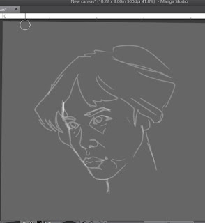
digital chalk pencil study


Wednesday, January 17, 2018

Developing the online brand ... and the growing pains associated with it

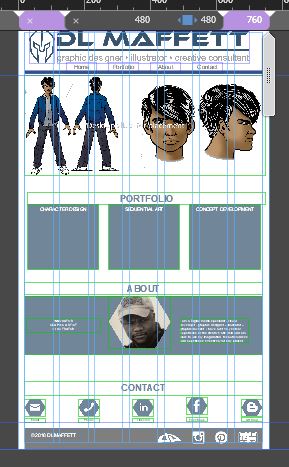
As a requirement for final portfolio I must come up with a website. Here are the three different views

480 Breakpoint for Mobile Portrait View Ports


 760 Breakpoint for Mobile Landscape View ports


  1280 Breakpoint for Desktop View ports


I am blessed that I already purchased my domain name and hosting years ago. I had a site up and running it was very dated. I chose to redesign the look and feel of my page so that the branding matches across all media, blog, face book, business cards, sample prints and printed art book

I wrestled all this past weekend getting the layout correct for my website. After literally fighting with Adobe Muse, I got my  break points to work right.  I blame Muse because I am too immature to accept the idea that it could be user error. If I would have only listened to Mary Ziimnik's instruction and paid closer attention to breakpoints in responsive design, I would have gotten this sooner... but hell better now then never.  

The light bulb literally just came on! I was very frustrated because the layout worked on one device and not another. So I went to viewportsizes.com to reference common view ports. This was most helpful. NOTE TO SELF break points are at 480, 760 and 1280! anything below 480 should view well on portrait mobile devices, 760 should  view well on landscape mobile devices and 1280 should view well on most desktop devices. I tested these on two different tablets and two different android devices as well as resizing on my desktop. And guess what! It works!  I like responsive design and used a dynamic style approach but still kept my layout static. The reasoning is that I want the site to look the same and not dynamically change as the view port resizes for this. I will revisit the idea later but for this final portfolio project I am finding that basic is better.

WHAT SUX IS THAT I ACCIDENTALLY UPLOADED THIS SITE TO SOUL OF A HERO instead of DLMAFFETT.COM ! This content replaced my web comic content. No worries though because every thing is backed up. I will be a while though till I get it all sorted back out. The good part is that I needed to clean up the SOAH website and get it ready for cleaner and more polished look, with some wordpress interaction. Ugh. Growing pains and learning lessons!

This may be rudimentary to some but may help give others that breakthrough they needed. If you need to discuss feel free to drop me a line in facebook messenger

for those who are interested below are the old layout and look for my personal art site. once the new site is developed and launched these layouts will no longer be used

home

about

resume

portofolio

If you are a real glutton for design punishment here is my original layout from 2014. VERY Dated!


Here is the layout for the Tactical Pencil Website... This will be changing some too. I will tone it down a bit but I like the icons and look. I want to have a linked and shared brand with my personal art page as well as my business. 

desktop
 tablet
 mobile


Tuesday, January 2, 2018

Working out with my Sensei today

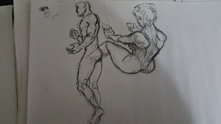
Got to do do some figure and gesture drawing with my good friend and sensei, Afua Richardson. We did worked in our respective studios but were able to draw together using Google Hangouts and sharing screens. We did 1, 5, 10 and 20 minute poses using  figurosity and new master's academy.  Here area some of today'd doodles, some digital some traditional.

20 min figure gesture (digital)

10 min  gesture (digital)


 1 min gestures (traditional charcoal)

2 min gesture (traditional charcoal)


5 min gesture (traditional charcoal)


Monday, January 1, 2018

Back in the Art Dojo

I have spoken at length with my tutors, mentors and professors and they all have suggested that I go back to the basics to build on the foundations that I have learned thus far. In doing so I am striving to put in an at least an hour a day doing nothing but gesture and quick figure drawings.

 A large criticism is that I dont have a true "style". It was then explained that this is because I look at various different artists and styles and tend to emulate them. Though I would glean important things from them, my style was not developing into something unique and as a signature. I was also told to focus on artists whose style I enjoy and want to emulate, to develop my style. I chose the talented Frank Cho, and Tom Bankcroft on the professional industry end, Orr-Malus on the indie side.  I enjoy both of these two because they have such basic clean lines while their styles are highly expressive. So for these next few mothns I hope that you will see an influence of both of these great artists in my style as it develops.

These 5 min studies are done using traditional charcoal pencil


 These exercises should strengthen my understanding of anatomy and flow for my drawings. I've noticed some progress just this week. For that I am thankful.


Hue and Value? That is another story and struggle for another day.

Saturday, November 11, 2017

Reworking the Soul of Hero Triptych Cover

I am working of final portfolio pieces for Graduation at Art Institute of Atlanta. The three part Triptych styled cover will be part of my body of work. I posted this earlier showing my progress. In reviewing the line work there were some anatomical issues.

Reworked line art


Original line art.


The issues are subtle but composition wise they create a much better look. In the original I tried to use composition to cover up my artistic defects and flaws. Such as hands, hair and proportion.

Monday, March 27, 2017

Daysleeper Animatic

Creating the Animatic


I have survived storyboarding class. I enjoyed the class and learned a lot. I think my strong point as an artist is in visual story telling. This semester I learned how to use Adobe After Effects via trial by fire! And the fire was HOT!

I found that when creating storyboards and animatics the process and planning are just as important as the application and execution.  I think that creating a shot list starting with 000 and going to 010, 020,030 ect is the most effective and efficient rout. When translating the script to boards it's easy to miss something and its easy to add it back in if you have at least 10 positions to play with.

Next is setting up the boards. Its best to create each board as an individual Photoshop layered image. Even if the board, is not going to animated or calls for an animatic doing so allows you to add this effect if needed.

Also I learned that SketchUp is your friend. Set design is a snap as well as set animations and walk throughs.


Here is my storyboarding final... enjoy!

Color Study 3/27/17


this is a random color study for facial hue, lighting and shading. I am struggling... I MEAN STRUGGLING with my painting in these areas. I am trying not to sink into a artist depression or block! I look at my classmates and they paint the way I want to be able to. I was able to have a good conversation with my good friend patrick and he let me borrow another book on painting. Patrick is amazing in his understanding of light and shading. I taking some of his concepts, ideas and executing them. I wont quit... Im just a little down right now....

Saturday, February 11, 2017

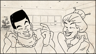
Ratchet Rapunzel Animatic


It has been a life long dream to make comics, cartoons and animation. I remember times doodling flip books in the corners of my elementary school text books and then making my own flip books. Last year a close childhood friend sent me one he found in storage that I made when I was about 10. I was a cheesy Robotech Mecha fighting off Zentradi Battle pods. But I digress.

I was tasked with creating an story board and Animatic for my StoryBoarding and Animatics class at the Art Institute. The project started with us having to create our own fairy tale with as twist. I chose Rapunzel, not that I particularly liked the story but I thought it would be short and less complicated to tell. Boy was I wrong....

This "Ish" was hard as "uck"! I never made an animated sequence before. I watched enough cartoons and documentaries to understand the concept. And am a supporter of Don Bluth's Dragon's Lair movie so I got a lot of good perks that teach animation techniques. But as for using Adobe AfterEffects... the Art Institute said pretty much "Watch this 5 min You Tube tutorial made by some other student who really cant teach that well but has a good grasp on the concept" After watching said video about 10 times I was both frustrated and discouraged. But Darth Maffett does not quit! so I did what I do... put my nose to the grid stone, pour be a few shots of Whiskey and started at it.

Another challenge was after we got our final story boards approved, the final assignment in A rough Animatic was due 72 hours later. Luckily the instructor gave some extensions. But that really didn't benefit me since I have other classes and other deadlines. So I had to push this one out in 72 hours.

I did learn that I can make animatics but that it takes some time.

My plan is to make future mini issues and plot points in Soul of a Hero into animatic / motion comic format.

Shouts out to Jermica, JazMan and Jabbar for being my voice actors and Renee for the moral support!

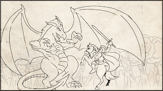
here are the story board panels