Thursday, October 20, 2016

Learning Conceptual Design - Kali


Harry Hausen's original Production Concept


This was a fun project. I have toyed with the idea of a multi armed character for a while. But never really had any use. So when we were challenged to remake characters Harry Hausen designs from "The Golden Voyage of Sinbad" I chose Kali. I remember watching this movie a few times as a kid in elementary school. Kali always scared me because I thought, that if I had to fight her she had multiple arms and swords.

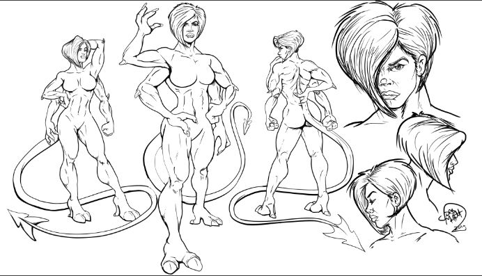
I started my research and saw that the goddess was normally drawn blue, I started with a blue concept but as I got to the final stages, a light grey skin tone seemed a better choice.

I wanted to have her costume look like it was painted, almost like a henna tattoo.

The largest challenge was the anatomy. I believed that her race would have for latissimus dorsi, pectoralis and scapula. But since this is the female version, though she had four pecs she only has two mammary glands /breasts. This keeps her having a familiar sexy female  aesthetic.

I liked the idea that she would have three fingers. I imagined her race living in a tropic area, like the amazon, with high mountains. They would need strong hands to climb, so the three digits would offer strength and stability to hold heave and climb. The same for the feet. They stand on three toes and this allows stability in trees. The tail to me was the most interesting. The tail originates in the C7/T1 area of the spine. I'm thinking that it will give some stability when climbing also, allowing the manipulation or helping moving limbs or coiling around objects to bring them near for inspection while giving a greater range of motion to the tail.

As for the art process. I learned to consider lighting more, also I am less afraid now to color and flat and add some tonal changes to my flats.

You may see her as a character in a future fantasy project. My idea is that these characters are the natural rival and enemies of Jazsman's Centaur and pursued relentlessly by Cody's Cyclops.

Saturday, August 27, 2016

Darth Maffett speaks out on Misty Knight!


I gotta vent on this one. I am happy as the next brotha to see Luke Cage getting his own show. And in true Luke Cage fashion he is dating a white chick (spoiler… who he gets pregnant and has a daughter with in the comic). And like most Black comic fans I am STOKED to have the possibility of Misty Knight being a character. But what I do have a problem with is with the casting of black women in comic movies. They all pretty much are light skinned, skinny, with very european looking features. 
I’ll give you storm.. (cause HALLEY BERRY IS NOT STORM… and yeah Alexandria Shipp looked better but meh….) BUT MISTY!? Come on! Misty is a hard boilded NYC cop who got her arm chopped off! I don’t think she should look like a damn Victoria secrets model. She should look like she could take and give a punch! Remember this is the chick that roomed in college with Jean Grey. And if as sista has to to deal with mental telepath nut case like her then she should be more sturdy. Comics like Hollywood constantly down play the true beauty of the races! Not everyone has to look like he or she stepped of of the Highlands of Scotland for goodness sake!


My choice… Adrienne “Black Cindy!”Moore. Don’t hate or judge because all yinz know her character rocks the cell blocks at Litchfield Penitentiary! Moore has proved her chops as an actress! Before anyone goes on with she needs to be in character and show more range argument… Let me remind you that SAM JACKSON is in a ton of movies and pretty much is the same character (save a few movies…). I enjoy me some Sammy J but sometimes his character range is limited. Back to Moore… Even if she had the same vibe and attitude as Black Cindy… I think it would work as Misty and make the character more believable. As for Simone Missick, I think she would make a hella Storm! 

Oh and the art work above is from a character study for my Marvel Submission that will feature MY VERSION of Misty Knight! She is gonna be Plus Sized Ass Kickin' Crime Fighting Machine!

RANT OVER!

ILD230 Project #3 - S.H.I.E.L.D. Repulsor pistol


For this project I had to create a set of instructions on how to operate a simple item. I though since I am going the S.H.I.E.L.D. genre … create a Stark A.R.C. Technology based weapon. Ok, We all know Stark Technology is not real and it’s just a NERF gun. BUT! In my mind I AM A SHIELD special agent and this is one of the weapons at my disposal to fight, terrorist mutants, bad guy super humans, and people who piss me off in general!

I created a 3d  model of the gun and then rotated it in various directions to get the correct feel of a instructional manual. (it kinda has a throw back to my digital illustrationfinal where I drew a Stormtrooper blaster)

Reference photo for the 3D model

3D WIP


ILD 230 Project #2 - Stark Hand A.R.C. Repulsor


The next technical drawing project was to come up with a functioning item. Of course I wanted to do Captain America’s shield but it was too basic of an item. So I chose to make an IronMan Stark Repulsor. I bought one of these a few years ago (and the IronMan Mask… and the WarMachine Mask … and the Iron Patriot Mask…Don’t judge me… ).


Jedi Master Moyers said that he wanted us to make various “skins” for the item that we drew. So I created a War Machine version, a Model 42 version, and a Camo version… as well as the traditional Mark IV version.

This project made it into the school display box so I am stoked!


Note Cody Wilbourn was the hand model for this project


ILD 230 Project #1 - Just another screwdriver


This project was for technical illustration. Finally something I can draw without getting frustrated. I have spent many late nights, early mornings and times in between trying to come up with technical drawings for various client projects. So when Jedi Master Moyers assigned the padawans of Ai Atlanta in technical drawing class to make a technical drawing of an ordinary item I was like “score!”

I pick the Black and Decker electric screw driver. I am intimately familiar with this item because it’s the “go to” tool in my tool box. I’ve owned a lot of them. (they tend to get broken so I have to buy another about every other year).

The most challenging part was the front adjustment grommet. I think I got it though.


Final Vector Technical Drawing

Reference Image

Monday, August 15, 2016

D.L. can I have a piece of gum?


Today's color study is of my art buddy Noelle. She is a up an once fashion major turned up and coming fine artist.

This particular piece is accurately titled "D.L.? Can I have a piece of gum?"-Noelle in repose. Simply because Noelle has asked me for gum for the past 2 semesters while we slaved away under the tutelage of Prof. Moyers.

Noelle is a talented painter! I mean home girl can stroke! Check out her blog Artistrfun.wordpress.com to see her stuff. I like the reference photo because it truly captured her personality.

This particular piece was illustrated digitally using sketchbook pro using my Samsung Tablet.  I started out with the observing her base photo taken by Kalonji Almond.
Screenshot_2016-03-23-18-15-26

I then did a quick pencil study to get the feel and flow of the pose

I next did a more detailed pencil study using a digital light box technique


Thursday, June 9, 2016

Commissioned to Honor an American Hero

I would like to first thanks all who prayed for me during this commissioned project. I am deeply thankful and appreciative. This was a very emotional art piece for a deserving client. Ms. Loretta has went through various emotional hurdles in her efforts to honor her father's memory. She commissioned better yet trusted me to create a portrait of her father, 1st Lt. James Baker.


Lt. Baker was a member of the 101st Airborne and served as a platoon commander in Vietnam. Lt. Baker gave the ultimate sacrifice and was killed in action prior to being able to meet his baby daughter Loretta.  Lorretta seeking to connect and carry on her father's legacy joined the army herself. Loretta then went onto support and counsel student veterans at a local college.

Unfortunately Loretta had very few photos of Lt. Baker to remember him by. She asked is there anything that I could do, with the few photos she had.

So I had to work my mojo, but that was not good enough so I sought prayer from yinz guys. And my spiritual mother Pauline Z reminded me that I need to stop focusing on my so called Jedi powers and seek Gods help. So I did... Thanks mama P, you have been keeping me on the straight path since I was 6.

I heard from Loretta today and she was able to spend time at her father’s grave site and give honor to a man that inspired her. I am grateful that she trusted me with the task of bringing her father image to canvas and paper.

Anyhoo...


Here are the original photos I had to work with.
  

I then had to find a suitable body reference for Lt. Baker. This young Ranger did the trick... You can always depend on a Ranger to lead the way.


and then with the power of photoshop! Photoshop is a great tool for making photo references in this case. I printed a 4x7 of this photo ref for her too so she would have unique photo of her father with all his posthumous awards and honors.


I then did a pencil study for my base drawing


then an advanced sketch for the image


next did my base tones


and the final


And thus my first commissioned portrait 

So I'm like struggling to make a C in Advanced painting I told Professor Moyers... the other students may have better grades... but I'm the student that's gettin work! HOOAH! and ROO!


ILD311 Project 3 - Will Smith... Our last hope...

For project 3 we were tasked to draw a wealthy and famous person. I chose Will Smith. 
Why? A multitude of reasons. #1 He is famous #2 He is wealthy #3 He is the last hope for DC's cinematic universe. With the blunder of Batman VS Superman DC has a lot of work to compete with Marvel's Civil War. But at least B vs S was better than X-Men Age of Apocalypse. 

But my issue with DC in this character is that the non comic readers are going to confuse him with Deadpool and the in fall out and facebook banter is going to be classic. I love how people like to get on face book and sound like a comic expert because they saw a movie and read the back of an action figure box. Its like us nerds trying to talk about the Steelers or Penguins .We know the teams, the players and maybe the game, but thats about it... same for the non comic types. 

But I digress

This sketch is rather large, Im thinking like 20" x 24" ish and hand inked. No digital on this one. I also inked using brushes. I wanted to try and work as quick as possible, to simulate drawing at a Con. So the likeness is... meh but the message conveyed, at least I think.

Below is the final


These are the warmup sketches


Sunday, May 8, 2016

Advanced Painting Midterm...

The Sibyl of Delphi…


Prof David Moyers continues in his relentless efforts to push and forge me into a better artist. I love this guy for this! He tasked us to recreate an "old masters" painting.  Prof Moyers is a great inspiration and coach. I am proud to be one of his students. But I need to chill with the admiration because folks will think I am trying to kiss up... 


This piece is my midterm project for advanced painting. I chose the Delphic Sibyl. I was introduced to this piece by my mentor and muse Prof. Tracey Hawkins. I remember hearing listening to Prof. Hawkins explain the process of how Michelangelo came about painting the Sistine chapel. I was intrigued by Michelangelo’s process and the stories behind the paintings on the chapel ceiling. The Delphic Sibyl called to me, when I learned of her. I don’t know why. Maybe it was her muscular arms, or her powerful sitting pose, or possibly the eyes. Her eyes say volumes. Is she pissed, scared or about to beat the breaks off that little cherub behind her for screwing up her dictation? I don’t know but I want to find out!  What I enjoy most about it her is the subtle variation in color and the contrast of the blue of her scarf with the browns and reds of her hair and skin.

In creating this piece I started by making my base illustration. A simple line drawing as a guide for the value and tonal changes of the image.


I next created my base coats in Yellow Orche annd Viridi. I followed up by adding in a wash of Yellow orche and Burnt Sienna and another with Viridi and Phalo Blue. This gave a nice base of mid tones.


I did my final touch ups with washes of Phalo blue, Burnt Sienna and Milky white.


I plan to come back often and rework this piece, as I also work the Bathsheeba, by improving on mimicking the Master Michelangelo an also changing the model but keeping the base feel of this beautiful woman. 

Wednesday, May 4, 2016

ILD311 - All Hail the Queen

Today’s midterm assignment… pencil illustration using hatching and line work, without blending for shading….Yup right up my ally yo!

So, I chose one of my favorite subject… Katey Segal as Gemma Teller. Katey is just hot. I don’t care what yinz say…She was hot as Peggy Bundy, she was hot as Gemma Teller, she was hot as Nancy Gilroy…  

I like Katey because she is glam without glam. Yeah she has had some things worked on, but overall she has the “dude your mom is hot” vibe going on.


This illustration took all of 2 to 3 hours to complete (in multiple settings – because I was very sick while trying to complete this). I got a new light box, which was just awesome and it really helped lay out the basic structure and anatomy of this portrait.

initial pencil sketch in progress


First round critique


second round critique

ILD311 - My Brother's Keeper...


This project was pretty dear to me. It is a way to honor a fallen hero that I never met but had a great impact on me. Kenneth Lee Wimberly, SR. was a great man, great soldier, and great cop. He was struck down in his prime and left behind a legacy that should be remembered and honored.


Having the honor and privilege able to serve on the same SWAT team that Kenny help find is one of my most prideful moments I can recall being a cop. 


BOOYAH! Your brothers in arms miss you and those little brothers you never knew (me) honor and salute you!


Bathsheeba In Blue #2 Final renders

As I continue this journey in art, I am finding that I am evolving as a person also. As Pablo Picaso found himself in “blue” period, as well as Yves Klein (IKB) … I am also finding myself enamored with the hue, temperature, and tone of blue.  But mine is not one of depression it is one of mania! I am excited about the future, what it holds, the unsure apprehension, the challenge, the adventure. God created me a warrior. He created me with fear but also blessed me with the courage to conquer it. I was raised by both parents that I am not to fear and that I am to seek out that which seeks to destroy me and illuminate it without reservation, without question and without mercy! If that language is too harsh for you or you are offended… then you are not a warrior.

This same mindset found me to be drawn to the character Bathsheba… She was focus of King David’s lust, passion, and desire. She was his muse. There can be much told about the story, characters and reasons. I will leave you to ponder you own opinions and feel free to post them.   But for me I was inspired by the spectacular sculpture of Bathsheba by renowned sculptor Benjamin Victor. I happened to stumble on this masterpiece while doing anatomy research. I fell in love. I saw in Victor’s work how David fell into Bathsheba’s spell. Victor captured the moment perfectly. I

Thus Bathsheba in Blue will be my signature piece throughout my art life on this world.  I plan to continue to repaint this until I get it perfect, then paint it again changing the model and making her various woman, of various sizes, races and shapes. Because I think there is something more here than just a woman taking a bath and a King spying on her. There is a spiritual symphony of love, lust, lies and life being orchestrated before your very eyes. Unfortunately the church refuses to accept the beauty of this entire story and wants to focus on the “the thou shalts…”, this is evil, that is Holy instead of the understanding the choice beauty and freedom of free will, and the inevitable consequence of that choice….
 I wrote more than intended on this, but onto the art. I present you Bathsheba in Blue #2…


Thursday, April 14, 2016

ILD 420 Advanced Painting Project 1 - Bathsheba in Blue

Im back at it again. I'm making the transition from graphic artist to fine artist. Its not a transition as much as adding a skillet. I found that I ENJOY painting and want to become better.

Learning the basic techniques of scumbling, gradient and lifting using acrylic paints is awesome.

Developmental art as it evolved in progress


Final unmounted presentation