
480 Breakpoint for Mobile Portrait View Ports

760 Breakpoint for Mobile Landscape View ports
1280 Breakpoint for Desktop View ports

I am blessed that I already purchased my domain name and hosting years ago. I had a site up and running it was very dated. I chose to redesign the look and feel of my page so that the branding matches across all media, blog, face book, business cards, sample prints and printed art book
I wrestled all this past weekend getting the layout correct for my website. After literally fighting with Adobe Muse, I got my break points to work right. I blame Muse because I am too immature to accept the idea that it could be user error. If I would have only listened to Mary Ziimnik's instruction and paid closer attention to breakpoints in responsive design, I would have gotten this sooner... but hell better now then never.
The light bulb literally just came on! I was very frustrated because the layout worked on one device and not another. So I went to viewportsizes.com to reference common view ports. This was most helpful. NOTE TO SELF break points are at 480, 760 and 1280! anything below 480 should view well on portrait mobile devices, 760 should view well on landscape mobile devices and 1280 should view well on most desktop devices. I tested these on two different tablets and two different android devices as well as resizing on my desktop. And guess what! It works! I like responsive design and used a dynamic style approach but still kept my layout static. The reasoning is that I want the site to look the same and not dynamically change as the view port resizes for this. I will revisit the idea later but for this final portfolio project I am finding that basic is better.
WHAT SUX IS THAT I ACCIDENTALLY UPLOADED THIS SITE TO SOUL OF A HERO instead of DLMAFFETT.COM ! This content replaced my web comic content. No worries though because every thing is backed up. I will be a while though till I get it all sorted back out. The good part is that I needed to clean up the SOAH website and get it ready for cleaner and more polished look, with some wordpress interaction. Ugh. Growing pains and learning lessons!
WHAT SUX IS THAT I ACCIDENTALLY UPLOADED THIS SITE TO SOUL OF A HERO instead of DLMAFFETT.COM ! This content replaced my web comic content. No worries though because every thing is backed up. I will be a while though till I get it all sorted back out. The good part is that I needed to clean up the SOAH website and get it ready for cleaner and more polished look, with some wordpress interaction. Ugh. Growing pains and learning lessons!
This may be rudimentary to some but may help give others that breakthrough they needed. If you need to discuss feel free to drop me a line in facebook messenger
for those who are interested below are the old layout and look for my personal art site. once the new site is developed and launched these layouts will no longer be used


for those who are interested below are the old layout and look for my personal art site. once the new site is developed and launched these layouts will no longer be used
home
about

resume

portofolio
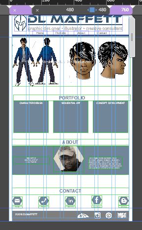
If you are a real glutton for design punishment here is my original layout from 2014. VERY Dated!

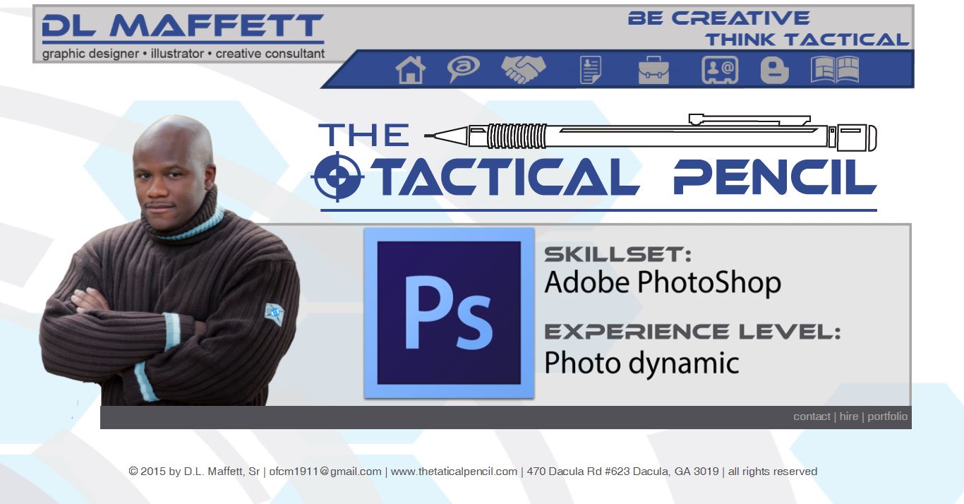
Here is the layout for the Tactical Pencil Website... This will be changing some too. I will tone it down a bit but I like the icons and look. I want to have a linked and shared brand with my personal art page as well as my business.
desktop

tablet

mobile

No comments:
Post a Comment